Singapore is a dynamic island nation that offers a unique interior design canvas as modernity blends with tropical charm. The need for private havens—places that provide a break from the hectic city life—is only going to increase as we approach 2026. Often disregarded, curtains have a significant impact on a room’s atmosphere and appearance. They are your home’s silent storytellers, controlling how light and shadow interact while whispering stories of peace or vitality.
Selecting the appropriate curtain color is an investment in Singaporean homeowners’ quality of life, impacting both the general atmosphere and everyday comfort. This guide explores the top 5 curtain colors that are expected to rule Singaporean interior design in 2026, providing information on their allure, application techniques, and unique ambiance. As we examine these new trends, get ready to turn your homes into stylish and tranquil retreats.
The strategic use of color is crucial in Singapore’s dynamic landscape, where space is frequently at a premium. Rather than being boring, neutrals are becoming sophisticated powerhouses that can create a serene atmosphere and increase visual space. Particularly, warm taupe & soft beige are set to be the clear winners of the 2026 interior design color scheme. These hues are invitations to relax, take a deep breath, and find serenity in the ordinary; they are more than just paint on fabric. Their innate adaptability makes them the ideal basis for a wide range of interior designs, from the organic simplicity of the Japandi aesthetic—a blend of Scandinavian and Japanese influences that has enthralled homeowners all over the world—to the minimalist chic that characterizes Scandinavian design.
These hues are inspired by nature, reflecting the soft earth and sandy beaches, and they provide urban homes with a much-needed link to the natural world. The Allure of Soft Beige: Creating Airy and Expansive Living. Soft beige is a color that speaks volumes without shouting thanks to its subtle elegance and soft warmth.
Soft beige curtains can create the impression of sunlight gently diffusing through a gentle sand dune. Beige serves as a visual expansion tool in Singapore’s frequently small living areas, deceiving the eye into thinking that the space is larger and more airy. It’s similar to letting in a lot of fresh air, which makes your space feel more spacious and free.
| Rank | Curtain Color | Popularity (%) | Recommended Room Type | Trend Description |
|---|---|---|---|---|
| 1 | Soft Beige | 28% | Living Room, Bedroom | Neutral and calming, complements natural light well |
| 2 | Deep Emerald Green | 22% | Study, Living Room | Rich and luxurious, adds a touch of nature indoors |
| 3 | Warm Terracotta | 18% | Dining Room, Living Room | Earthy and inviting, perfect for cozy atmospheres |
| 4 | Classic Navy Blue | 17% | Bedroom, Study | Timeless and elegant, enhances focus and relaxation |
| 5 | Soft Lavender | 15% | Bedroom, Bathroom | Subtle and soothing, ideal for restful spaces |
In Singapore’s tropical climate, where constant daylight is a given, this color is incredibly good at reflecting and enhancing natural light. Soft beige curtains can eliminate shadows & produce a consistently bright and welcoming atmosphere by reflecting light throughout the space. Because of its capacity to absorb and softly diffuse light, it can also soften harsh sunlight, resulting in a cozy, glare-free space that is ideal for reading or just unwinding. Warm taupe’s sophistication: a basis for organic textures. A richer cousin of beige, warm taupe has a sophisticated yet grounded appeal.
It’s a color with a subtle depth that can elegantly anchor a space and feels both modern and classic. Taupe embodies this feeling of natural comfort and sophisticated elegance. Imagine the rich color of a perfectly brewed coffee or the smooth, cozy texture of worn leather.
When combined with natural materials, its warmth makes it a great option for creating a comfortable atmosphere. Warm taupe curtains make the ideal background for adding elements like wood, rattan, and linen in Singaporean homes, where a connection to nature is becoming more & more sought after. This color works especially well in homes that follow Scandinavian or Japanese design principles, which place a strong focus on organic forms, clean lines, & practical beauty. Taupe’s subtle complexity makes it go well with a variety of accent colors, from earthy tones to subdued greens & blues, providing a great deal of styling flexibility.
Including Neutrals in Singaporean Minimalist and Japanese Designs. Soft beige and warm taupe are your friends if you’re drawn to the simple, minimalist style or the calm fusion of Scandinavian and Japanese sensibilities. These hues make sure that every component of a minimalist home has a function and adds to the overall tranquility.
They serve as a blank canvas that lets thoughtfully selected furnishings and décor take center stage without overpowering the senses. These muted colors are fundamental to Japanese interior design, reflecting both the Scandinavian embrace of hygge—the idea of comfortable contentment—and the Japanese appreciation of simplicity. Imagine a living room filled with lush greenery, light wood furniture, and basic artisanal ceramics. The ideal finishing touch would be curtains in warm taupe or soft beige, which would blend in with the surroundings and create a peaceful haven that feels both contemporary and deeply rooted.
To add dimension and prevent monotony, the key is to layer textures and subtle variations within the neutral palette. A sophisticated interplay of light and texture can be achieved by combining sheer, nearly translucent beige panels with a heavier linen weave. Interior design trends are reflecting this deep connection as the world finds comfort in the embrace of nature more and more.
Nature-inspired colors are becoming the cornerstone of modern living spaces rather than a niche hobby. In Singapore, a city-state that is renowned for aiming to be a “City in a Garden,” incorporating green hues into homes seems especially natural and pleasing. In 2026, muted sage green—a gentle, earthy hue that conveys a sense of peace and rebirth—is becoming a major player. This hue is more subdued & sophisticated, like the delicate leaves of a sage plant or the soft mist that falls over a forest, rather than the vivid, bold green of a jungle canopy.
Its exceptional capacity to bring a feeling of peace and freshness into any space, serving as a natural remedy for the stresses of contemporary life, is what makes it so appealing. Muted Sage Green’s Calming Effect. A deep, healing breath can be compared to the soft essence of muted sage green. It can turn any area into a peaceful haven because of its almost therapeutic quality. Bringing the soothing effects of nature indoors is a big benefit in Singaporean urban life, which is frequently hectic.
Sage green curtains can help you escape the stresses of the outside world and create a calm haven inside your house. Because of its calming qualities, this color works especially well in bedrooms, encouraging deeper relaxation & more restful sleep. Imagine being gently awakened to a peaceful day by the gentle glow of dawn peeking through sage green curtains. It’s an effect that goes beyond simple aesthetics; it’s about creating an atmosphere that prioritizes well-being. The Adaptability of Sage Green in Singaporean Interiors.
Muted sage green’s remarkable adaptability is what makes it so alluring for 2026. It can blend in with a variety of existing color schemes & interior designs, making it a color chameleon. Sage green curtains offer a subtle yet noticeable pop of color that adds personality without overpowering rooms that are already painted in neutral hues like whites, creams, greys, or even other taupe and beige hues. They can add a hint of organic warmth to more minimalist arrangements or lessen the starkness of modern design.
Sage green can also serve as a grounding element in a room with more existing colors, balancing brighter tones and keeping the area from feeling overly chaotic. It complements wood finishes, metallic accents like matte black or brushed brass, and a range of fabric textures, from crisp linens to luxurious velvets. conforming to Biophilic Design & 2026 Nature Trends.
The broader trend in interior design toward biophilic design is inextricably linked to the rise of subdued sage green. In order to improve our well-being, biophilic design principles promote integrating natural elements into our constructed environments. In keeping with this important trend for 2026, you are actively inviting the tranquil essence of nature into your home by selecting sage green curtains. This color selection is a deliberate step toward designing a living area that feels more alive, grounded, & supportive of mental and emotional equilibrium.
Even if your view is of the city skyline, it’s a way to bring the outdoors inside. Sage green is a perfect fit for this philosophy because of its subtle, organic qualities, which conjure up images of tranquil landscapes & lush foliage. Many people have a strong desire to escape to a peaceful resort where the surroundings are serene & the air is warm.
Interior design decisions in 2026 are reflecting this desire by evoking that same feeling of exoticism and relaxation. This movement is being led by light terracotta and warm sand tones, which infuse our homes with the earthy, grounded warmth of sun-baked landscapes. These hues are more than just hues; they are tactile sensations that evoke visions of prehistoric ceramics, desert landscapes, & the cozy embrace of organic soil. In contrast to the fleeting nature of contemporary life, they provide a feeling of stability & permanence. These colors give Singaporean homeowners the chance to add the sophisticated simplicity of a chic haven or a laid-back, bohemian vibe to their living areas.
Light Terracotta’s Warm Welcome. Light terracotta exudes warmth & friendliness with its soft, earthy blush. It’s similar to the soft color of a sun-kissed terracotta pot that holds a healthy plant. This color works incredibly well to create a warm and inviting ambiance.
Light terracotta draws you in and makes a space feel cozier and more intimate than some cooler tones that can seem detached. It strikes a deep chord with our natural, organic connection to the earth. Light terracotta provides a special kind of warmth that feels both cozy and exotic, evoking sun-drenched Mediterranean villas or tranquil Southeast Asian retreats in Singapore, where tropical humidity can occasionally make spaces feel less grounded. The Delicate Beauty of Sand Tones.
Sand tones provide a sophisticated neutral that is both soothing and subtly opulent, ranging from light cream to warm golden hues. Sand tones can create a delicate beauty similar to the shifting & shimmering fine grains of sand on a spotless beach. They offer a delicate, all-encompassing background that is very adaptable. These hues provide a softer, more comforting embrace than pure white because they are less harsh. They are superb at preventing glare and producing a calm atmosphere by softly and diffusedly absorbing & reflecting light.
For Singaporean homes that strive for both openness and coziness, sand tones are especially good at creating an airy, spacious feeling while maintaining a feeling of warmth and coziness. complementing bohemian and resort-style interior design with textured textiles. When light terracotta and sand tones are combined with a rich tapestry of textured fabrics, their true magic comes to life. Due to their tactile nature, these hues encourage the investigation of comparable textures in soft furnishings. Imagine a chunky knit throw in a complementary terracotta color and linen curtains in a warm sand tone.
Alternatively, sheer, nearly translucent panels in a creamy sand color could be layered over light terracotta drapes with a delicately woven pattern. These combinations are characteristic of bohemian and resort-style interior design. They talk about natural fibers, artisanal craftsmanship, and a carefree, leisurely way of life. These earth tones, when paired with materials like rattan, jute, macrame, and different weaves of cotton & linen, will create an immersive and profoundly calming space for Singaporeans who want to create a vacation-like atmosphere in their homes all year round. The warm color scheme is given depth and visual interest by the textures, which keep it from appearing flat.
It is impossible to overestimate the timeless appeal of lighter neutrals when designing sophisticated & welcoming interiors. Often confused with plain white, cream and off-white actually have a subtle warmth & depth that make them ideal for interior design. These colors are not about starkness; rather, they are about a soft, radiant light that can make any space appear brighter, more roomy, & unquestionably sophisticated.
These hues have a special ability to work in perfect harmony with the natural illumination in Singapore, a city endowed with an abundance of tropical light, enhancing its positive qualities and softening its intensity when necessary. Because of their timeless quality, they will continue to be a stylish and relevant option for many years to come, providing a steady stream of light and airy elegance. Cream: The Gentle Radiance of Light & Heat.
Cream is a neutral color with a noticeable warmth that evokes the richness of fresh milk or the delicate shimmer of pearls. Cream adds a cozy softness that instantly makes a space feel more opulent and welcoming, in contrast to pure white, which can occasionally feel chilly or sterile. It’s similar to capturing the softest sunlight and incorporating it into your house’s design. Cream curtains serve as a filter in Singapore, where the tropical sun can be very strong.
This diffuses the intense light into a gentle, ambient glow. This produces a calm, bright atmosphere that makes rooms feel both intimate & open at the same time. Cream is a very versatile color that works well with a variety of accent hues, from delicate pastels to more striking jewel tones.
It serves as a chic foundation that lets other components take center stage. Off-White: The Crisp Purity of Airy Elegance. Off-white, a shade that lies just above pure white, has an unmatched capacity to brighten a space while maintaining a crisp purity. It’s the delicate shade of seafoam or the color of recently laundered linen.
Even the smallest spaces appear larger and more spacious thanks to this shade, which is a master of illusion. It can eliminate any feeling of clutter or confinement and is a visual breath of fresh air. Off-white curtains work especially well in Singapore to maximize the amount of natural light that enters homes.
They bounce this light around the space, reflecting it and giving the impression that it is very large. Because of this, they are perfect for smaller homes or apartments where giving the impression of more space is important. Any interior can have a sense of contemporary sophistication thanks to off-white’s simple, understated elegance.
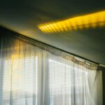
Sheers with drapes are layered to control light and depth. Layering is one of the best ways to use cream & off-white curtains since it provides unmatched light control, depth, and visual interest. Imagine combining a heavier drapery in a blend of creamy linen with a sheer panel in a delicate off-white voile. When the sheer layer is closed, light diffuses softly, shielding your interior from harsh glare while letting a soft luminosity flood the space.
This produces a dreamy, ethereal effect that is evocative of mist or gentle clouds. The heavier drapes can add a significant design element when they are open & frame the window. This layering technique not only improves the appearance but also has useful advantages, such as making it simple to change the light and privacy levels throughout the day. This produces a dynamic interplay between light and shadow, adding a subtle elegance that uplifts the entire space and reflects Singapore’s abundant but frequently potent light. Grey has evolved from a practical color to a sophisticated pillar of contemporary aesthetics in the ever-changing fabric of interior design.
Its softer versions are especially popular for 2026, with light grey becoming a popular option for Singaporean homes. Instead of being boring, this color has a subtle elegance and incredible versatility, making it the perfect background for discriminating homeowners. It’s a color that creates a sense of serenity without compromising style, giving other design components a platform to really shine.
Similar to a well-tailored suit, light grey curtains are flawless, classic, and complement everything they are paired with to create a polished and harmonious living space. A gentle & sophisticated background of light grey. The color light grey conveys sophistication. Although it avoids the starkness of true white, it is a neutral with a subtle coolness that provides a welcome contrast to the more overtly warm tones.
The soft atmosphere that light grey can produce is similar to the soft, diffused light of a cloudy sky. This translates to a feeling of sophisticated peace in a Singaporean home, a serene haven amid the bustling energy of the city. Its subtlety is what gives it its elegance; instead of drawing attention to itself, it draws attention to the surrounding beauty.
Light grey curtains serve as a gorgeously subtle canvas that lets furniture, artwork, and decorative accents take center stage without competing for visual dominance, regardless of whether your style is minimalist, contemporary, or even Scandinavian-inspired. Light grey curtains maximize open-plan spaces. Light grey curtains are ideal for highlighting the fluidity of open-plan living, which is a popular choice for many contemporary Singaporean homes. Maintaining a sense of flow and coherence in expansive, connected spaces requires a unified color scheme. That’s exactly what light grey offers.
Without producing noticeable visual breaks, it serves as a subtle link between the kitchen, dining area, and living area. Its ability to filter light also greatly influences how space is perceived. Light grey curtains allow plenty of natural light to enter the space without making it too harsh or overexposed by softly reducing the sunlight.
This makes the open-plan layout feel more spacious and harmonious by creating a light, inviting atmosphere that promotes movement and interaction. Light Grey’s Low Maintenance and Light-Filtering Properties Make It Practical. Light grey is a wise option for busy Singaporean homes because, in addition to its visual appeal, it has several useful benefits.
First off, light grey textiles typically require very little upkeep. Light grey provides a happy medium, in contrast to darker hues that may be more likely to reveal dust or extremely light hues that may be more likely to reveal stains. It tends to better hide common dust and small stains, so you can enjoy your beautifully decorated home for longer periods of time and require fewer deep cleanings. Second, its ability to filter light is outstanding. The tropical sun’s glare and heat can be effectively reduced by light grey curtains, making the interior temperature more comfortable and possibly lowering energy expenses.
They maintain the room’s brightness & coziness by doing so without totally obstructing the natural light. Light grey is a very wise choice for modern living because it strikes a balance between functionality and visual appeal.
.
FAQs
1. What are the top curtain colors predicted for Singapore in 2026?
The top curtain colors for Singapore in 2026 are expected to include earthy tones like terracotta and olive green, soft pastels such as blush pink and light blue, as well as classic neutrals like beige and gray.
2. Why are certain curtain colors trending in Singapore for 2026?
Curtain color trends in Singapore for 2026 are influenced by factors such as the tropical climate, interior design preferences favoring natural and calming hues, and global color trend forecasts emphasizing sustainability and wellness.
3. How do curtain colors affect the ambiance of a room in Singapore homes?
Curtain colors can significantly impact a room’s ambiance by influencing light filtration, mood, and perceived space. For example, lighter colors can make rooms feel more spacious and airy, while darker or warmer tones add coziness and warmth.
4. Are there any practical considerations when choosing curtain colors for Singapore’s climate?
Yes, practical considerations include selecting colors that help manage heat and sunlight, such as lighter shades that reflect sunlight and reduce heat absorption, and materials that complement the chosen colors for durability in humid conditions.
5. Where can residents in Singapore purchase curtains in the trending colors for 2026?
Residents can find trending curtain colors at local home furnishing stores, specialty curtain retailers, and online platforms that offer a wide range of fabrics and custom options tailored to the 2026 color trends.